

This data from the previous post on pushing the power meter information to InfluxDB from RTLAMR & RTLAMR-COLLECT can be read by Grafana and turned into various graphs. This assumes you’ve already set up a data source for InfluxDB, that will not be discussed in this post.
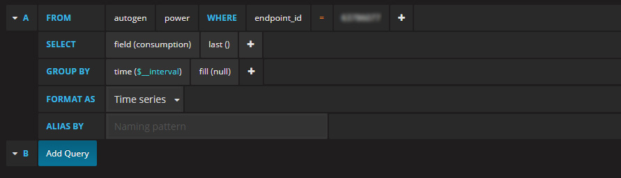
First let’s create a graph of the current running power usage based on the existing interval it is received from the meter – this is for each entry from RTLAMR as the meter doesn’t output at a specific rate.
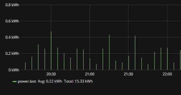
For the first query, we’ll put the defaults in. But you’ll notice that the values produced into the graph are very high.

So looking at the above graph, we see it’s reporting at roughly 200-400kWh – this is because of the way the output is put into InfluxDB and calculated. We need to divide this by 1,000 to get the proper kWh measurement.
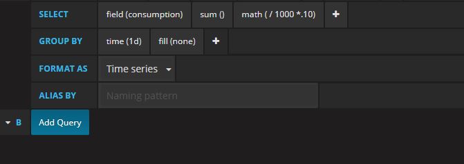
In the query, we’ll click the + for the SELECT line & choose math. Then after it populates, click on the 100 shown and add a 0 to make it 1000

Now if we check the graph it will display the correct differences in the meter reporting values.
Additionally, we can calculate this to see the cost per kWh if you know what your power company charges. For example, my power company charges $0.093 for half of the year & then $0.103 the other half. In my graphs, I simply calculate to $0.10 (10 cents) per kWh.
In the math option under the SELECT query from before, if you click in there, you can simply add after the 1000 change it to / 1000 *.10
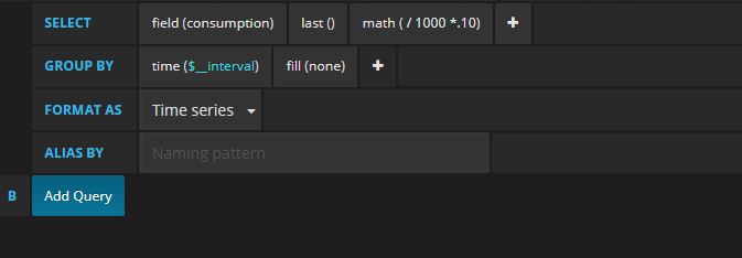
The fill was also changed from null to none which will make the bars on the graph thicker. We can see in the graph below that we have both the average & total options checked in the Legend as well as the Unit of Dollars selected under the Axes tab. Currently, it’s not possible to overlay multiple Units for the same metrics in Grafana that I’m aware of.

After creating those, below are the two graphs based on the default time series of your current dashboard view. This can be changed/modified per graph of course.

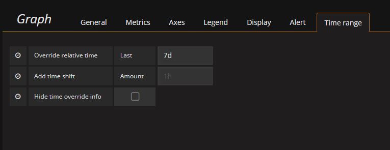
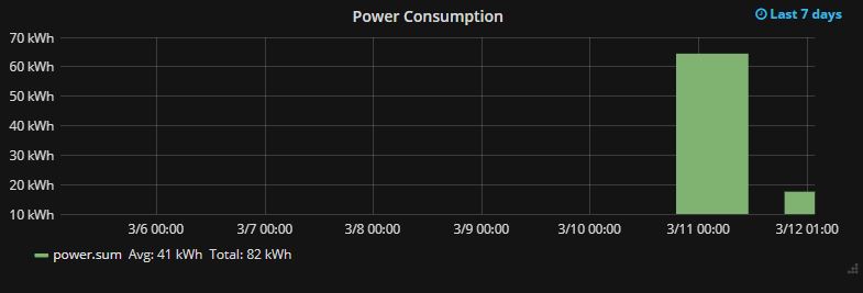
To change to a static time frame, you can use the Time Range tab > Override relative time and change it to something like 1w (for 1 week) or 24h (for 24 hours) etc. So we’ll change to display a graph for 7 days & a cost per day total.
Next we’ll modify the query to output a SUM and change the time($_interval) to 1d.
This will now give us a graph that shows the estimated total cost per day based on the calculation of the SUM using the math option in the SELECT portion of the query. We can also add the Avg and Total display options there from the Legend tab.

We can place this graph side by side with another graph of the same value but only using /1000 and NOT *.10 – change the Axes Unit to Energy > kilowatt-hour (kWh). This graph would display the same as the cost graph (assuming your duplicated the previous graph) but will show total kWh per day as opposed to cost per day.
Once the data is pushed into InfluxDB and you can read it with Grafana, it can be manipulated to give a good overview of current & historical power usage.
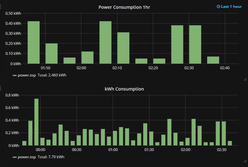


We can even go as far breaking the data down to cost per hour and even further. Cost per minute would not be ideal because of the frequency of the output reading from the meter, it’s not consistent but cost per hour, per 15 minutes or half hour etc would work perfectly.
